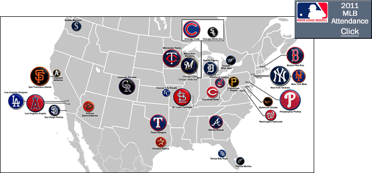
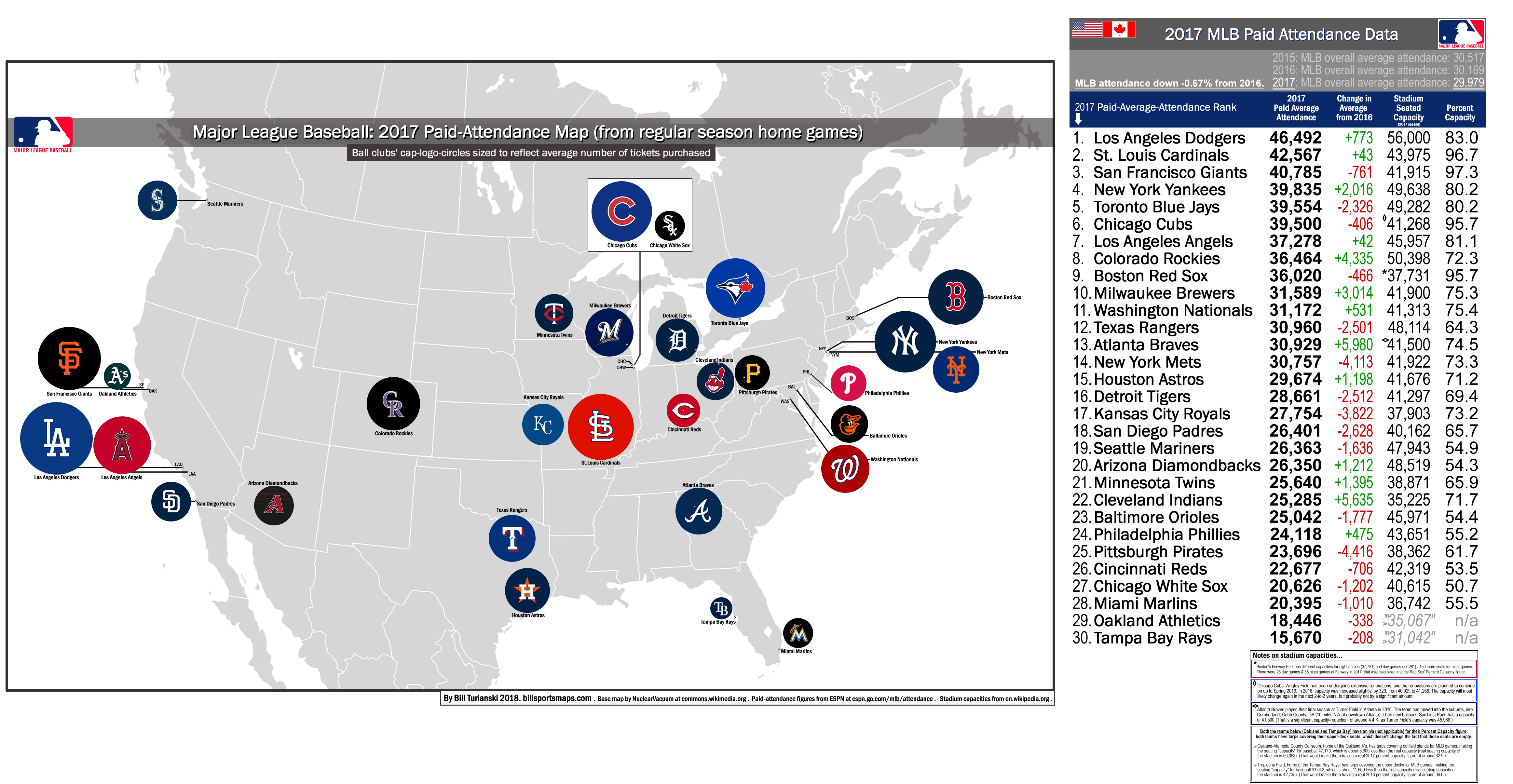
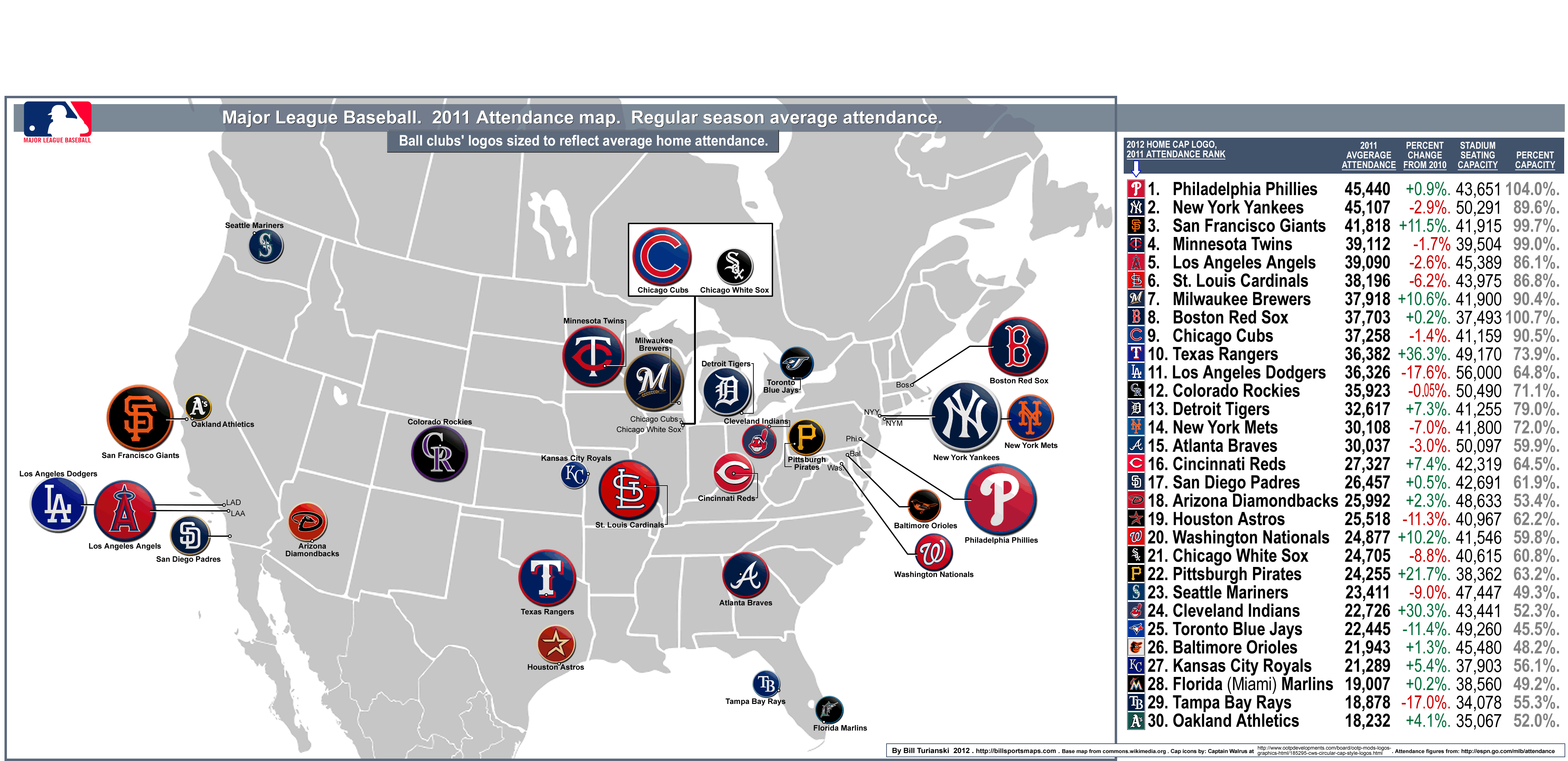
2011 Major League Baseball average attendance map
…
…
Please note: to see the most recent MLB paid-attendance map-and-post, click on the following: category: Baseball >paid-attendance.
…
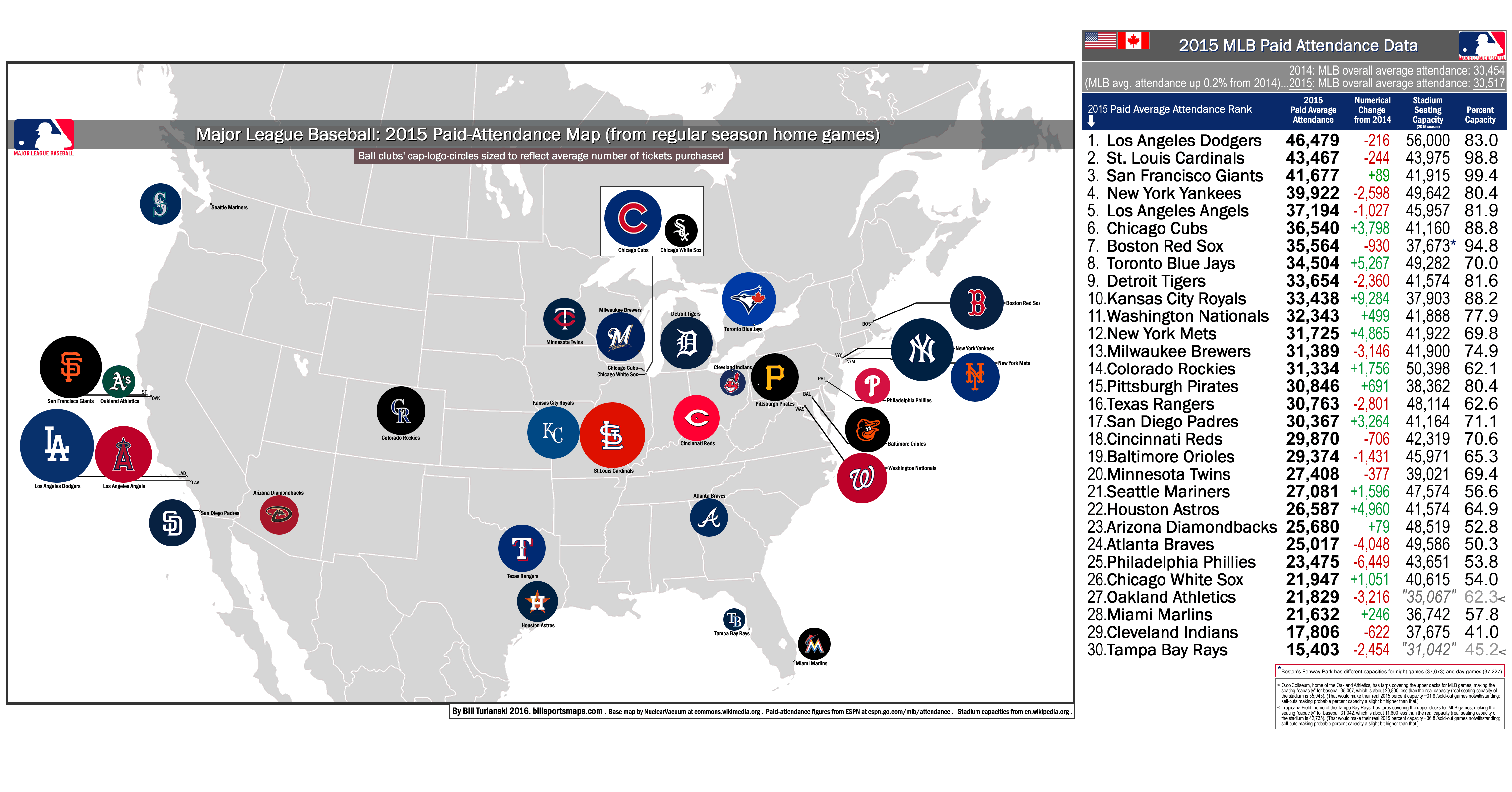
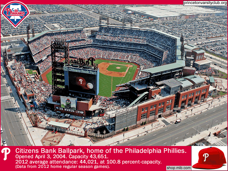
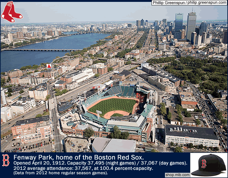
On the map, which you can see in full by clicking on the image above, each ball club’s 2011 home ball cap crest is sized to reflect 2011 gate figures…the higher the team’s average attendance, the larger the team’s circular logo is on the map. At the right on the map page are the 30 MLB teams (with their 2012 home cap crest), listed by 2011 attendance rank. Three extra stats for each team are included at the far right-hand side of the map page – Percent-Change from 2010 attendance, Stadium Seating Capacity, and Percent-Capacity [percent-capacity is arrived at this way...average attendance divided by stadium capacity equals Percent-Capacity]. Two teams played to sold out and standing-room-only crowds all last season – the Philadelphia Phillies and the Boston Red Sox.
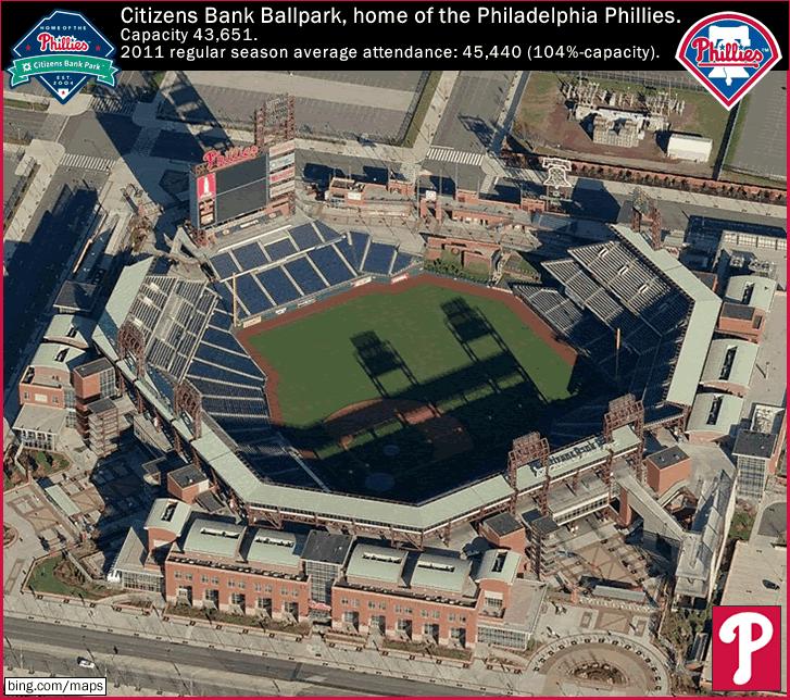
Image credit above – bing.com/maps/Bird’s Eye satellite view.
In 2011, the Philadelphia Phillies supplanted the New York Yankees as the highest-drawing team in Major League Baseball. For the third straight season, and ever since they won their second-ever World Series title (in 2008), the Phillies have been playing to standing room only, for their entire 81-game home schedule. For the 2011 regular season, the Phillies pulled in an impressive 104.0 percent-capacity at their 43,651-capacity Citizens Bank Park in downtown Philadelphia, Pennsylvania. The Phillies drew 45,440 per game in 2011. And yes, the Phillies only led in attendance in 2011 because of certain decisions that the New York Yankees’ front office has made in the last 4 or 5 years (see below), as well as the implosion of the Los Angeles Dodgers, who have been the best-drawing MLB team throughout much of the last 5 decades (and who most recently had the best MLB gate figures in 2009). But it is still a noteworthy achievement that the best-drawing ball club in America in 2011 was from the 5th largest city in the United States – Philadelphia, Pennsylvania (1.5 million city population/5.9 million metro-area population {2010 census figures}).
…
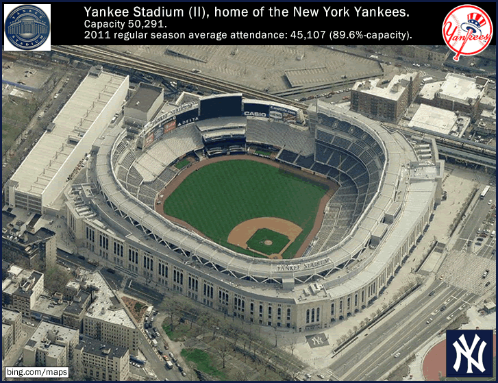
Image above credit above -bing.com/Bird’s Eye satellite view.
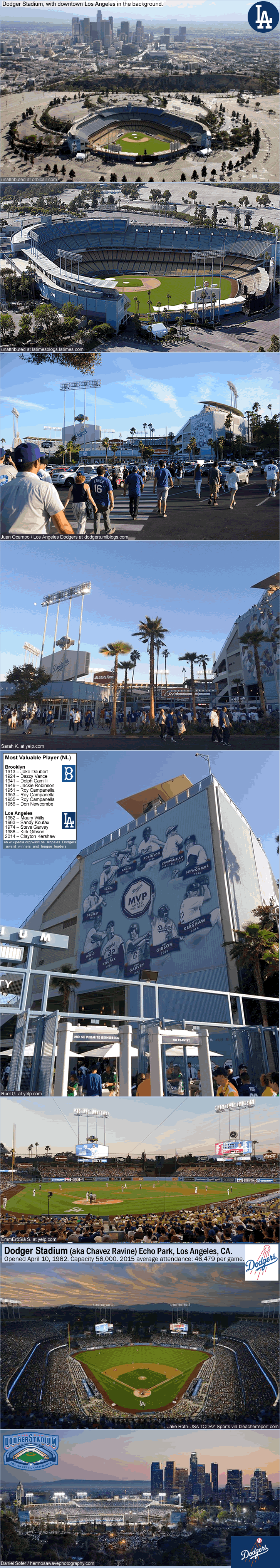
The New York Yankees, who drew second-best last season, only played to 89.6 percent-capacity at the prohibitively expensive Yankee Stadium (II) in The Bronx, New York. In the 2011 regular season, the Yankees drew 45,107 per game at Yankee Stadium II (opened in 2009). When the Yankees began building their new ballpark in the mid-2000s, they decided to make the new Yankee Stadium around 6,000-capacity smaller than the original Yankees Stadium. Yankee Stadium (I), 1923 to 2008, had a final capacity of 56,936. The present-day Yankee Stadium has a capacity of 50,291. That makes its capacity 6,645 seats smaller than the original Yankee Stadium. The Yankees’ top brass knew they could recoup revenue by higher-priced tickets, and by luxury boxes, and by things like putting restaurant franchises in the new stadium. But the thing is, the Yankees’ organization priced out a whole segment of fans who either couldn’t afford high three-figure-priced tickets or were offended by the concept of paying such larcenous fees for good seats. They call the first eight rows the “Legends Suite”. Giving the obscenely expensive ($500 per seat, on average) front rows some pretentious name like the Legends Suite was pretty pompous. When the stadium opened, after the first couple of games, there started to be vast swaths of empty seats right behind home plate and up each foul line. On television broadcasts, it looked so weird, in a bad way, in a way that you couldn’t stop looking at it, like a car wreck. No one wanted to pay a thousand bucks or so for one ball game. It’s like the Yankees front office went on this collective gigantic ego trip, and thought that people would actually be willing to shell out over a thousand dollars for one ticket to one regular-season ball game – because it’s a Yankees game – like every game in Yankee Stadium is supposedly a Super Bowl-caliber event. Please. The arrogance of the Yankee organization is truly stupefying. So a few months into the 2009 season, the Yankees slashed their most expensive tickets (some tickets were actually $2,600). The final average attendance in 2009 in the first season at the new Yankee Stadium was 45,364 – meaning there were, on average, over 4,500 empty seats per game…in the opening season of the stadium (!). In 2010, average attendance rose a little bit over one thousand per game to 46,491 (an increase that was aided by the inevitable uptick in crowds following a title-winning season, after the Yankees had won the 2009 World Series title). In 2011, average attendance went down around 1,350 per game to 45,107. So the Yankees had even worse attendance in 2011 than in 2009, when they had their empty-seats-in-most-of-the-front-rows public relations disaster.
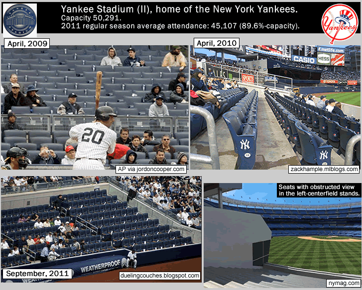
Photo and Image credits above – jordoncooper.com zackhample.mlblogs.com. duelingcouches.blogspot.com. nymag.com.
There are fundamental fan-unfriendly design problems in the new Yankee Stadium. The partitioning of fans in the “cheap” seats (see photo above at the left), fenced off from the rich-folks-seats is creepy (it evokes the sense that the Yankees’ organization and their rich fans in the Legends Suite seats are part of the 1%). Here is an excerpt from the Wikipedia page on Yankee Stadium (II), “…Legends Suite seats are also separate from the other lower bowl seating and are vigorously patrolled by stadium security, with the divider being described as a “concrete moat”. Fans that do not have tickets within this premium section in the front rows are not allowed to access it, nor stand behind the dugouts during batting practice to watch players hit or request autographs.”…That’s the New York Yankees management for you, building a moat to separate the 1% from the masses. Another egregious aspect of the new Yankee Stadium is the fact that there are hundreds of seats that have large and crucial parts of the field obscured from view. Management fit so many things like a Hard Rock Cafe and an Indian casino sports bar into the new Yankee Stadium layout, that two large sections – one section in the right-center field stands, and one section in the left-center field stands (see photo above at the right) – cannot see a big chunk of the left field or right field areas (see the satellite image of the new Yankee Stadium [further above] where you can see how the center field restaurant blocks views from the stands on either side of it). $35 to park your car in the lots around the stadium also shows the Yankees organization’s disdain for their fans. The seats-with-blocked-views problem, as well as the fact that some fans are not renewing season tickets because of the poor fan experience at the new stadium, is discussed in the following short article – From the Field of Schemes site, from April 6, 2011, by Neil deMause ‘Yankees fans disguising selves as empty seats again‘. Outside of the left field bleachers area (which are just aluminum slats with no back, more suitable for a high school stadium than for the most successful baseball team on the planet) or nosebleed third deck seats, it is still pretty much a rip-off to attend a Yankees game these days. As a commenter in the post linked to above says, “It’s just not fun when everything costs twice to 10 times more than it should.” And it shows in the gate figures…the New York Yankees, the most successful franchise in North America, the winner of 27 World Series titles, as well as a team that has made 16 out of 17 straight post-season appearances and won the most championships in the last 2 decades (with 5 World Series titles in 17 years)…these Yankees cannot draw higher than 90 percent-capacity. In a stadium whose capacity they reduced by 6,450 from their previous stadium. A previous stadium which had charm to spare and an awesome and historic grandeur, and which, in its final season in 2008, had an average attendance of 53,069 per game (93.2 percent-capacity). Message to Yankees’ management – nice epic fail with your new stadium. Your corporate greed sucked the soul right out of the place. And no thanks at all for tearing down the House that Ruth built.
…
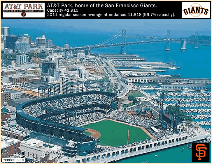
Photo credit above – marriott.com.
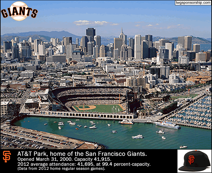
Third-best-drawing in 2011 were the then-reigning champions, the 2010 World Series winning San Francisco Giants, who just missed out playing to full capacity in 2011, at 99.7 percent-capacity. The Giants drew 41,818 per game last season to their 41,915-capacity AT & T Park, a jewel of a ballpark on the shore of San Francisco Bay. The Giants saw a +11.5% increase in attendance after winning their first-ever World Series title as the San Francisco Giants [the New York (baseball) Giants won 5 World Series titles in the years that this franchise was located in Manhattan, NY (from 1883 to 1957)]. The San Francisco Bay area has 2 MLB teams (the Giants and the Oakland A’s) and is the 5th largest combined statistical area in the USA, with (via a 2012 estimate) a population of 8.3 million in the 11-county region (which includes San Francisco/Oakland/San Jose, plus Santa Cruz and San Benito counties), see this ‘San Jose/San Francisco/Oakland, CA Combined Statistical Area‘.
…
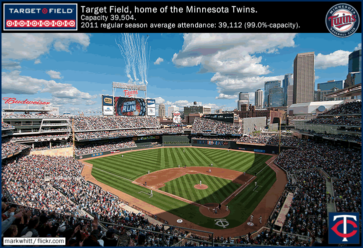
Photo credit above – markwhitt at flickr.com.
The fourth-best-drawing ball club in 2011 did not even play .500 baseball, and that was the Minnesota Twins, who drew 39,112 per game in their second season at beautiful Target Field in downtown Minneapolis, Minnesota. Coming from a municipality of their size, the Minnesota Twins have drawn pretty decent over the last decade, even before they had a good venue, wih a 23,759 average in 2002, then starting a 6 post-seasons-in-9-years run and closing their Metrodome era with a 29,486-per-game figure in 2009 (the poor Vikings of the NFL are still stuck in that dump). Nevertheless, one can see the effect a brand-new ballpark has on increasing attendance. The Twins are drawing 39,000 per game, while playing in the 16th largest metro area in the USA. Minneapolis/St. Paul’s metro area population is 3.3 million {2010 figure}. If the Twins rebound and challenge for the post season once again in 2012, they will probably maintain these numbers (they played to 99.0 percent-capacity in 2011).
…
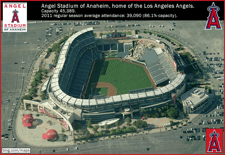
Image credit above – bing.com/maps/Bird’s Eye satellite view.
Fifth-best-drawing ball club in 2011 were the Los Angeles Angels, who challenged for the post season but eventually fell off the Wild Card pace. In 2011, the Los Angeles Angels did something they had never done in their 52-year history – they outdrew the Los Angeles Dodgers. The Los Angeles Angels averaged 39,090 (which was actually a -2.6% drop from 2010), while the owner-from-hell-plagued Los Angeles Dodgers averaged 36,326 (a drop-off of -17.6%, the worst in MLB; and the Dodgers have dropped fom #1 attendance draw in MLB in 2009 to the #11-highest drawing in 2011, losing 14,000 per game in a 2-year span). The Angels had come close to out-drawing the Dodgers twice before. In 2003, the year after the Angels won their first and only World Series title [in 2002], the team, then called the Anaheim Angels, drew about 1,400 less than the Dodgers, at 37,330 per game (an increase of 8,900 per game versus 2002), while the 2003 LA Dodgers drew 38,748 per game. And in 1987, the year after the Angels had made the playoffs and then agonizingly lost to the Boston Red Sox in the 1986 ALCS, the team, then called the California Angels, averaged 33,288, which was about 1,300 less than the Dodgers, who averaged 34,536 that year (1987). The Los Angeles Angels, along with the Washington Senators (II) [present-day Texas Rangers], were American League expansion teams in 1961, and the Angels spent their first season at the old PCL ballpark Wrigley Field (Los Angeles), before being renters at Dodger Stadium for 4 years from 1962-65. Since 1966, the Angels have played next door to Disneyland in Anaheim, Orange County, California at Anaheim Stadium [now called Angel Stadium at Anaheim, and NFL-free since 1995, thank goodness].
…
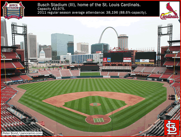
Photo credit above – Peter Bond at panoramio.com.
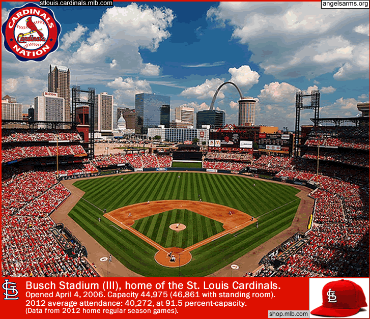
Sixth-best-drawing MLB club last season were the 2011 World Series champions the St. Louis Cardinals, who pulled in 39,196 per game, seeing a -6.2% drop in average attendance compared to 2010, and a 86.8 percent-capacity. This is the second time in 7 years that the Cardinals have crept into the playoffs almost anonymously, way below the radar and with the worst record of any playoff team that year, yet then gone on to outlast everyone else and claim the title [the St. Louis Cardinals boast the second-most World Series titles, with 11, second only to the New York Yankees, who have won 27 World Series titles]. From 2005 to 2010, St. Louis had a 6-season run drawing above 40,000 per game, and you can bet that in 2012 the Redbird faithful will swell the ball club’s gate figures this season closer to the 43,975-capacity of Busch Stadium (III). St. Louis, Missouri has the 18th largest metro area in the US, with a metro area population of 2.81 million {2010 figure}. The 18th largest city in the country, with just 2.8 million in the Greater St. Louis area, and the Cardinals are drawing 39 K to 40 K per game, year in, year out – that’s impressive.
…
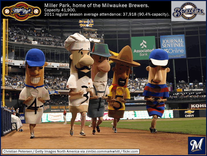
Photo above by Christian Petersen/Getty Images North America via zimbio.com.
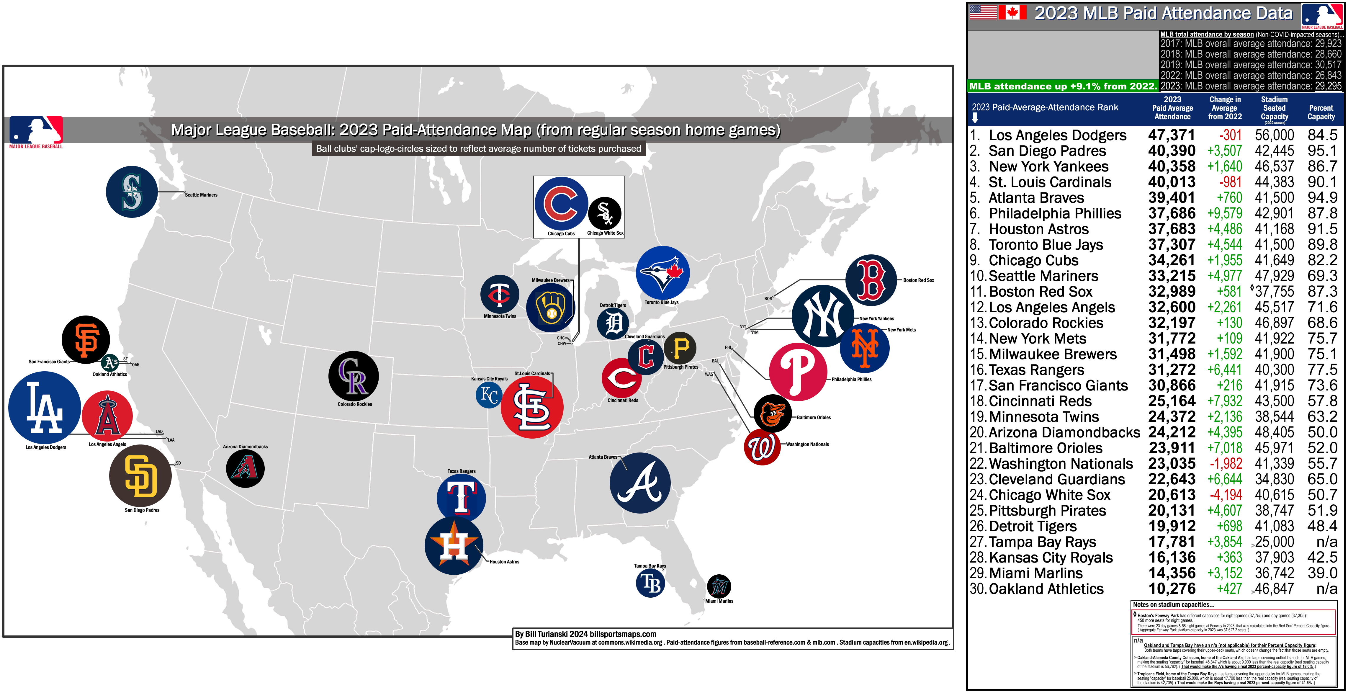
Seventh-best-drawing ball club in 2011 were the Milwaukee Brewers, who drew 37,918 per game (a +10.6% increase over 2010). The Milwaukee Brewers are much like the Minnesota Twins and the St. Louis Cardinals in that all three are Midwest-based ball clubs with a relatively new stadium and a recent record of post season qualification (the Brew Crew have made the playoffs twice in the last 4 years) – and who all draw very well for cities of their size. The metro area population of Milwaukee, Wisconsin is 1.55 million {2010 figure}, making it the 39th largest metro area in the United States [from en.wikipedsia.org, 'Table of United States Metropolitan Statistical Areas']. Miller Park, which opened in 2001, is sort of a surreal venue that features a retractable roof and plenty of open-air vistas thanks to transparent walls, and seems more like an amusement theme park than a ballpark. It has a fan friendly vibe including the Famous Racing Sausages (see above), and mascot Bernie Brewer and his multi-story slide (in the photo above you can just make out the huge, yellow, corkscrewing slide Bernie uses to celebrate Brewer home runs and Brewer victories, between the Chorizo Sausage and the Bratwurrest Sausage) {see this; also see this, from mlb.com, ‘The Famous Racing SausagesTM – A Historical Perspective‘.}. The Brewers can pack them in for a medium-small-sized market, but it must be pointed out that the Milwaukee Brewers have it easier than most MLB clubs when it comes to competition for the sports entertainment dollar – Milwaukee has no NHL team, no Division I college football team (the closet is the Wiscionsin Badgers football team in Madison, WI, which is 72 miles west of Milwaukee), and the closest NFL teams are in Green Bay, Wisconsin and Chicago, Illinois. But still, drawing over 37,000 per game, for 81 baseball games, in only the 39th biggest city in America – hats off to Milwaukee.
_
Thanks to Captain Walrus for the circular logos I used on the map, ‘Captain Walrus’ Circular Logos‘ (http://www.ootpdevelopments.com/board).
Thanks to the contributors to the pages at en.wikipedia.org, ‘Major League Baseball‘; and at the Ballparks of Baseball.com site, for ballpark capacity numbers.
Thanks to Baseball-Reference.com for attendance data from past decades, the following link set at 1987 MLB attendance.
Thanks to ESPN site for 2011 and 2010 attendance figures.


