…
This continues my category of Hockey – NHL and expansion (my last post from this category was about 3 years ago, National Hockey League, 1979-80 season, with four teams added (all from the WHA): the Edmonton Oilers, the Hartford Whalers, the Quebec Nordiques, and the Winnipeg Jets (I).
The 1991-92 season was the first expansion the NHL had in 12 seasons. Their last “expansion” was only technically an expansion…it was really a merger between the NHL and the outlaw-league the World Hockey Association, but it was decidedly a merger that was totally on the NHL’s terms (with the 4 WHA franchises coming into the league allowed to only retain 4 players per team, and the 4 WHA franchises being obliged to buy back former WHA players at $125,000 per player in the re-entry draft). If you want to read/see more about all that, click on the link above.
The NHL’s one-team-expansion of 1991-92 was something that was long overdue if only to balance out the schedule, because the NHL hobbled itself by operating for 13 seasons as a league with an odd-number of teams (which makes scheduling a nightmare). The creation of the San Jose Sharks franchise in 1991-92 saw the NHL’s return to the San Francisco/Bay Area after a 14-and-a-half-year gap. The previous NHL team in the Bay Area was of course the California Seals/Oakland Seals/California Golden Seals, who existed under 3 different names for just 9 seasons (from 1967-68 to 1975-76), then, due to the lack of adequate ticket-paying support, the franchise moved to Cleveland, Ohio as the similarly-poorly-supported Cleveland Barons for a mere 2 seasons, before going defunct after the 1977-78 season. An unusual deal was then set up between the dead-in-the-water Cleveland Barons franchise and the then-struggling Minnesota North Stars franchise (present-day Dallas Stars franchise). The Barons ownership group, headed by brothers George and Gordon Gund, took over the North Stars franchise, and the Barons roster was absorbed into the North Stars team.
As it is pointed out at the Sharks’ page at Sports E-Cyclopedia.com, following the considerable fan-excitement in California created by Wayne Gretzky’s 1988 arrival from the Edmonton Oilers to the Los Angeles Kings, there became renewed interest in placing a second NHL team again in the state of California. The Gund brothers tried to return to California by moving their still-struggling Minnesota North Stars franchise to the Bay Area. But the NHL balked at giving up on the Minneapolis/St. Paul area (though they did give up on the Twin Cities a few years later, and let the North Stars move to Dallas in 1993) [seven years later, the NHL returned to Minneapolis/St. Paul, Minnesota with the creation of the Minnesota Wild in 2000].
San Jose Sharks, established 1991-92 (the 22nd NHL franchise)…
So the NHL engineered a franchise transaction in which the Gund brothers sold the North Stars to a consortium including former Hartford Whalers owner Howard Baldwin and headed by Norm Green; and at the same time the NHL awarded a new franchise to the Gund brothers in San Jose, CA (with the team slated to start for the 1991-92 season). Because of building delays at the arena in San Jose, caused by the decision to increase the size and amount of luxury suites, the Sharks ended up playing their first 2 seasons (1991-93) at the old Cow Palace just outside of San Francisco (in Daly City, CA). In October 1993 the San Jose Sharks moved into the 17.5 K-capacity San Jose Arena (present-day name: SAP Center at San Jose).
Back-tracking a couple years to when the San Jose NHL franchise was first awarded (in 1990), an open poll was undertaken to determine the team’s new nickname. Over 5,000 names were submitted by mail, with the most popular nickname chosen being the Blades. That nickname was rejected by the Gunds, because they did not want a name associated with weapons. So the second-most popular nickname submitted was selected – the Sharks. There was a precedent for the name in California, the short-lived WHA team the Los Angeles Sharks. Also, sharks are very prevalent in that part of the California coast. As it says in the San Jose Sharks page at en.wikipedia.org, …”The name was said to have been inspired by the large number of sharks living in the Pacific Ocean. Seven different varieties live there, and one area of water near the Bay Area is known as the “red triangle” because of its shark population.”…{end of excerpt from San Jose Sharks/History}. {The prevalence of Shark-attacks in the waters near the Bay Area is shown in this chart by John Blanchard/San Francisco Chronicle at SFgate.com, here}. Also, see the images below for more on that. The map below also shows the locations of the two arenas that the San Jose Sharks have played in.
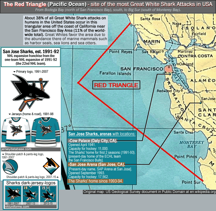
Photo and Image credits above -
Map, US Geological Survey document in Public Domain at en.wikipedia.org page Red Triangle (Pacific Ocean).
San Jose Sharks 1991-92 jerseys, illustrations by Jersey Database.com at jerseydatabase.com/ [browse - Hockey...see column for "Jersey Fronts", by team].
San Jose Sharks jersey logos, illustrations by Andrew M. Greenstein at nhluniforms.com/Sharks/Sharks.html.
A lot had changed in the 15 years in which San Francisco/Oakland/San Jose (aka the Bay Area) had no NHL team…
And the much-improved Bay Area economy of the early 1990s (and onwards into the Silicon Valley era of today) has contributed to the creation of an essentially healthy NHL team in a warm-weather locale (no small feat). The Sharks, who, although never having made it to a Stanley Cup finals, to this day play to full-or-nearly-full capacity most seasons (the Sharks played to 100 percent-capacity in 2012-13, and to 97.6 percent-capacity in 2013-14). [Note: the Sharks finally did make it to an NHL Stanley Cup Finals, in 2015-16, but lost to the Penguins 4 games to 2.]
The Cleveland Barons were the last major league sports franchise in USA and Canada to go defunct (in the 4 Major leagues of the NFL, MLB, the NBA and the NHL). The failure of the Cleveland Barons after the 1977-78 season was the reason the league got stuck with an odd-number of teams for 1978-79, and when the four WHA teams came into the NHL the following season (1979-80), the odd number of teams remained. It ended up taking the NHL thirteen years to fix it. In 1991-92 the San Jose Sharks were placed in the Smythe Division, joining Calgary, Edmonton, LA Kings, Vancouver and Winnipeg.
In 1991-92, the Sharks shook up tradition by having the then-unheard-of color teal (a dark-greenish blue-green), as their primary color. In that, one can see a connection to the late and unlamented California Golden Seals of the mid-1970s, whose third and final primary color was bright teal (a light-blue-ish blue-green). The original franchise, as the California/Oakland Seals circa 1967-70, wore kelly green with royal blue trim {see the 1967-68 California Seals uniforms here}. When Charlie Finley (then-owner of MLB’s Oakland A’s) bought the Oakland Seals in 1970, he renamed the hockey club the California Golden Seals and switched their colors to green and yellow-gold (like the A’s) {see the 1970-71 California Golden Seals uniforms, here}. Then three years later he upped the ante and switched the Golden Seals’ colors to that aforementioned pale teal and yellow-gold. {see the 1974-75 & 1975-76 California Golden Seals’ uniforms, here].}
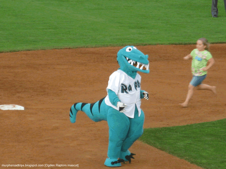
So all that teal and all those other variations of weird greenish-blue, in the color schemes of (expansion) sports teams? Like this (Mighty Ducks of Anaheim), and this (Vancouver Grizzlies), and this (Florida Marlins), and this (Charlotte Hornets), and this (Arizona Diamondbacks)?. Well, thank (or blame) Charlie Finley for the idea, and thank (or blame) the Gund brothers for reviving it. This is all opinion of course, and in my opinion there are very few exceptions where teal, or a color similar to teal, is appropriate and looks good…like this (Seattle Mariners) [which is technically not teal but rather a color greener than teal called Northwest Green] or like this (Miami Dolphins 1971 uniforms), [which is technically not teal but rather a color with more light blue than teal called Aqua]. I think teal is a color that belongs in the minor leagues, like this (Ogden Raptors Pioneer League ball club’s mascot; photo from murphsroadtrips.blogspot.com/2011/07/ogden-raptors-vs-orem-owls).
…
1991-92 NHL season…
1991-92 was the 75th anniversary of the NHL, and each team wore the 75th anniversary logo on their jerseys. There was a 10-day player strike late in the season in April, 1992, but the work-stoppage did not affect the final standings as all strike-cancelled games were made up. This necessitated an extension of the season schedule, and 91/92 ended up being the first NHL season whose playoffs extended into June.
In the 1991-92 Stanley Cup Finals, the Pittsburgh Penguins retained the Cup. Led by Hockey Hall of Famer (and current principal owner and chairman) Mario Lemieux, the Penguins won their second straight Stanley Cup title, sweeping the Chicago Blackhawks in four games.
Statistical leaders in 1991-92 NHL
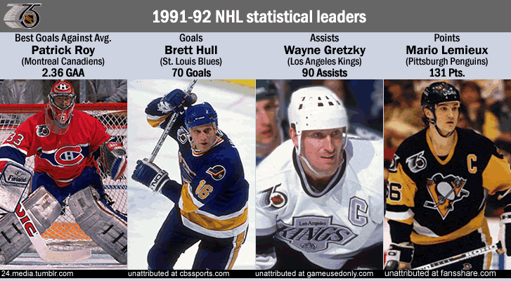
Photo credits above -
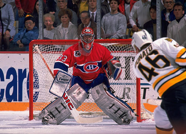
Patrick Roy, photo from 24.media.tumblr.com/tumblr_m1idj8TTkm1qm9rypo1_1280.jpg. Brett Hulll, photo unattributed at cbssports.com/nhl/halloffame/inductees. Wayne Gretzky, photo unattributed at gameusedonly.com. Mario Lemieux, photo unattributed at fansshare.com.
…
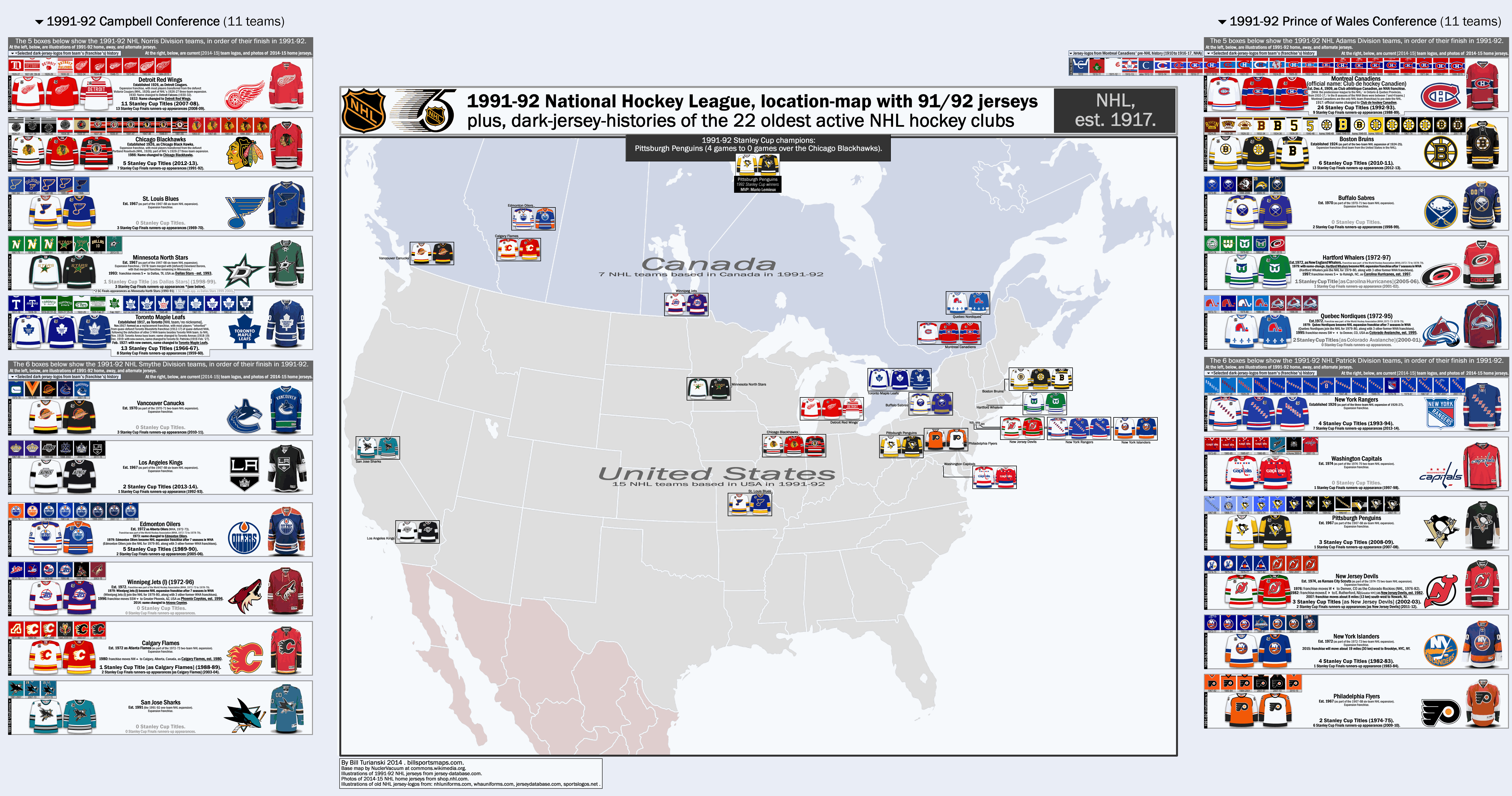
Elements of the map page
The map page features profile-boxes for each of the 22 NHL teams from 1991-92. These profile boxes are arranged by conferences (2) and divisions (4), and are arranged according to 1991-92 final standings. The profile boxes flank either side of the map itself, with the mostly-western-based-teams in the Campbell Conference on the left-side of the map page; and the mostly-eastern-based-teams in the Prince of Wales Conference on the right-hand-side of the map page.
The main feature of the map itself are the 1991-92 home, away and alternate (throwback) uniforms for each of the 22 teams from 91/92 {source: http://www.jerseydatabase.com/browse.php?sport=nhl}.
Inside each team’s profile box are the following…
-Selected dark-jersey-logos from the team’s (ie, the franchise’s) history, with dates of each jersey listed.
[These selected dark-jersey-logos from the franchise's history are located in a long-and-narrow pale-greyish-blue-colored box at the upper-left of each team's larger profile box. {Sources for all the old jersey-logos are:
jerseydatabase.com/ [browse - NHL];
nhluniforms.com;
whauniforms.com;
sportslogos.net/ [NHL].}]
-1991-92 uniforms (2 per team, or 3 for the “Original Six” teams).
-Text-block synopsis of team’s (franchise’s) history, with: date of establishment [first season], name-changes & franchise-shifts; Stanley Cup titles (with last SC title listed); Stanley Cup Finals runners-up appearances (with last SC Finals runners-up appearance listed).
-Current official logo [2014-15].
-Current [2014-15] home jersey (photos of the jerseys from shop.nhl.com).
Notes on the jersey-logo-history sections for the 22 teams –
Why am I showing the history of only dark jerseys? For brevity’s’ sake, and because that is what folks want. At this link at Yahoo.com Answers they cite the statistic that dark jerseys have always accounted for 65 to 75% of all sales of NHL jerseys (I bet it’s more like 80%+). The thinking in the 1970 to 2004 time-period was that it was better for the regularly-attending home fan to see all the other teams’ dark-colored jerseys…for the sake of variation. But as the sale of replica jerseys had become more crucial as a revenue-stream for each NHL team, by the early 2000s it was becoming apparent that more NHL teams wanted the switch to dark-jerseys-at-home in order to encourage the sale of more jerseys. I can’t say it any better than Jamie Fitzpatrick does in the following article on the subject, from 2009, from the About.com site,
What’s Up With The NHL Dress Code? – It used to be good guys wear white, bad guys wear black. Not anymore. (proicehockey.about.com/cs/businessofhockey/a/NHLjerseycolors).
White as the home team’s color in the NHL…
[In the NHL, white as the official color of each team's home jersey existed from 1970-71 to 2003-04. Prior to that it was the dark jerseys at home all through the "Original Six" era (1942-43 to 1966-67) and into the first three years of the second expansion era of the NHL (1967-68, 1968-69 and 1969-70). There was one major exception, and that was the Boston Bruins {Bruins; uniforms history at nhluniforms.com/Bruins}. Aside from their first season in 1924-25 (when the Bruins wore brown jerseys), the Boston Bruins in their first 24 seasons had only one jersey - and that was white (except for 1940-44 when they had an alternate yellow jersey). Then when the Bruins finally also wore a dark jersey (black), in the 1948-57 time period, they still wore white at home. In fact, the Bruins never started wearing black at home until 1967-68, and as just mentioned, a few season later the whole league switched to whites-at-home. The other minor exception was the Chicago Black Hawks of 1951-55, who wore their white jerseys at home in this time period {here}.]
The dark-jersey-logos from each franchise’s history are not a comprehensive set, but are pretty close to that, and represent all fundamental changes in each hockey club’s jersey evolution. I have avoided depicting white (or lighter-colored jerseys), except when that was the only jersey the team wore that season (circa 1910s and early 1920s), but a special exception was made for the first appearance of the Boston Bruins wheel-with-spokes logo (for the Hub-city team’s 25th anniversary in 1948-49, when that soon-to-be-iconic logo was only worn on the Bruins’ home-whites that season).
Also note that I avoided alternate jerseys in each team’s set of old jersey-logos (which would have made the whole exercise an incoherent mess). And if you are wondering why I included the god-awful Calgary Flames horse-head-puffing-out-flames-from-its-nostrils logo circa 2000-03 – well that is because that creepy logo was part of their 2nd uniform then, not their 3rd uniform/alternate (the Flames finally retired that bush-league logo in 2006). That is also the case for why the Washington Capitals black jersey with Capitol-dome logo (circa 2000-07) is shown, likewise the ridiculous Gorton’s-Fishsticks-fisherman logo that the clueless Islanders organization subjected Isles fans to (in 1995-97), and likewise the Flyers black jerseys (in the 2000s).
One other note, the Detroit Red Wings had their winged-wheel logo placed on their jersey un-centered, from 1934-35 to 1981-82 (the center of the wheel was where it was centered on, so that the right side of the jersey was blank, and on the map page you can see that by seeing the lower tip of the jersey-collar [on the Red Wings 1948-73 and 1973-82 logos]). The Wings finally nailed it down by enlarging the winged-wheel logo and centering it at the mid-point of the wing itself – that was in 1982-83, and the design remains the same to this day (that design is a work of art).
And speaking of logos that are works of art, there is probably an extra slight-tweak that the Montreal Canadiens had with their C-with-H-inside logo, and that was in 1932-33 to 1934-35, where the site called (the unofficial) NHL Uniforms.com has the C narrower {see it here, Canadiens [1932-35]. The official Montreal Canadiens site does not include that version of their logo, however, but that doesn’t necessarily mean it doesn’t exist, especially because with respect to another, much older jersey design the jury is still out – and that is the recently-unearthed jersey design of the Canadiens from way back in their early NHA days in 1911-12, the design of which the official Canadiens’ site recently displayed (see 5 paragraphs below, in the PS). So I included the 1932-35 narrow-C logo because, outside of a few slight color issues (see next paragraph) NHL Uniforms.com is pretty much the first and last word on the whole subject matter of major league hockey uniforms throughout the NHL’s (and WHA’s) existence.
Another issue I see with old Canadiens jersey logos is that the blue band on their red jerseys in the late 1910s through early-to-mid 1930s was probably a slightly lighter shade of royal blue. Going by old black-and-white photos of Canadiens’ jerseys from the 1920s and the 1930s will get you nowhere and lead you to erroneous conclusions, because reds and blues in old black-and-white photos often look misleadingly darker or lighter than their true shades of color (mainly because many photographers back then used color filters that rendered some reds darker and some blues lighter than what they looked like in real life). Jersey Database is the one source I used that depicts a shift in color in the Canadiens royal-blue-band in their red jerseys, and Jersey Database has the Canadiens’ royal-blue-band as a distinctly lighter-shade-of-royal-blue until 1934-35 {here}, with the modern-day darker-royal-blue band on the Canadiens red jersey beginning in 1935-36 (which was also the first season a white jersey was employed as an alternate jersey for the Canadiens, see this). The others simply maintain that the Canadiens have been wearing a darkish-royal blue band ever since the C-with-letter-inside style first came out (in 1913-14). But then what about this?…hockeygods.com/images/10663-Beehive_Team_Shields___Crests___Complete_Set___1930s. That blue in the Canadiens’ badge is clearly lighter than the modern-day blue in their jersey. Visual proof is obtained by simply comparing other teams’ badges there…and the shade of blue on the Canadiens’ circa-early-1930s badge is distinctly lighter-colored than the blue in the Maple Leafs’ badge and the blue in the Rangers’ badge. They should all be essentially the same color blue (with the Rangers’ blue pehaps very slightly lighter-blue than the Leafs’ blue), but the Canadiens’ blue is not the same as the Leafs’ and Rangers’ blue in that badge set. OK, so that badge set establishes the fact that it is very likely the Candiens’ blue band on their jerseys was noticeably lighter-colored up to the early 1930s. The next link further helps to prove it, because it is an illustration commissioned by the Montreal Canadiens themselves….Here is an old illustration of the 1930-31 Montreal Canadiens team…and although the image is small, you can see that the royal blue band is a lighter shade of royal blue than the one on the modern-day Canadiens’ jersey (that shade of blue on the 1930-31 Canadiens jersey and in the badge set from the 1930s both look like the shade of blue that the Quebec Nordiques wore). Then take a look at an old game-worn Rocket Richard uniform (from 1959-60)…the blue is now a bit darker {here}.
Sometime after 1930-31 the Canadiens’ blue band on their red jersey got a bit darker; I would have had the darker royal blue band starting in 1935-36, as per the illustrations at Jersey Database.com {again, here}, but then I found this, [Howie Morenz 1934-35 Canadiens jersey at Third String Goalie page at photobucket.com/ from this article, thirdstringgoalie.blogspot.com/2012/11/1934-35-montreal-canadiens-howie-morenz]. So I have the darker royal blue band starting on the Canadiens jersey one year earlier than Jersey Database does, at 1934-35. Anyone out there who has links to images (which either back-up or refute this), would be greatly appreciated.
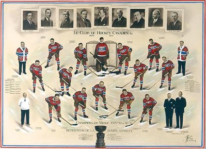
By the way, the H in the Canadiens’ logo does not refer to their other nickname of the Habs (les Habitants), but to the word Hockey – a word that is in the Montreal Canadiens’ official name, which is, to this day, Club de hockey Canadien (their official name was previously, Club athlétique Canadien [from 1909 to 1917]). In fact, “Club de hockey Canadien” is the name engraved on the Stanley Cup each time (a record 24 times) that the Montreal Canadiens have won the Stanley Cup title (their first Stanley Cup title pre-dates the NHL and was won in 1916 [over the Portland Rosebuds of the PCHA], their last Stanley Cup title was won in 1993 [over the LA Kings]).
PS,
the recently-unearthed 1911-12 Montreal Canadiens white-jersey-with-red/blue-sash-and-Gothic-C (see it here/third jersey & logo featured [1911-12]) is contested (quite convincingly), at Third String Goalie blog site, Setting the Record Straight – The 1911-12 Montreal Canadiens (thirdstringgoalie.blogspot.com). The article is worth checking out if you have some spare time, but essentially what is at issue here is that red-and-blue-sash (red-and-blue diagonal lines)…and Third String Goalie site says that only one photo exists of that sweater and in that photo there is just the Gothic C and no red/blue sash, and the conclusion is that that design with the red/blue sash did not ever exist. A few months later, another site that deals with hockey history from its early days, Hockey Historysis blog, posted illustrated images of very early Montreal Canadiens jerseys, {see it at the following link by scrolling down to see third jersey there at The Unintentional Arrival of Hockey’s Most Recognizable Uniform (hockeyhistorysis.blogspot.com, article by Iain Fyffe and illustrations by Danny Laflamme). There, they dispensed entirely with that probably-fictional red-and-blue-sash on that white 1911-12 Canadiens jersey. I have done likewise.
___
Source for Stanley Cup titles and SC Finals appearances by team, en.wikipedia.org/wiki/List_of_Stanley_Cup_champions#Active_teams.
Thanks to NuclearVacuum for the blank map of North America, File:BlankMap-North America-Subdivisions.svg (commons.wikimedia.org).
Thanks to shop.nhl.com, for photos of 2014-15 NHL home jerseys.
Special thanks to Jersey Database at Jersey database.com/ [browse - Hockey...see column for "Jersey Fronts", by team].
Special thanks to Andrew M. Greenstein at http://www.nhluniforms.com/index.html, and at http://whauniforms.com/index.html.
Special thanks to Chris Creamers’ Sports Logos.net.
And thanks to Third String Goalie blog for various bits of information.
